The Potential Pitfalls of Big Data
/You have probably heard the phrase “correlation not causation.” This is becoming one of my go to catch phrases as the accessibility of big data becomes more and more common. Investment strategists, market gurus, traders, all are increasingly relying on trend analysis derived from big data to shape their thesis.
With the technology revolution and Moore’s law, the accessibility to computing power has never been more apparent. With this development, artificial intelligence is increasingly being applied to large volumes of data to search for trends. According to Bloomberg, the world is creating 2.5 quintillion (not a typo) bytes of data per day. This has introduced more opportunities for processing, analyzing, and leveraging the information. Machine learning and algorithms are increasingly being used in trading and market predicting by computing vasts quantities of data to make predictions and decisions that humans just do not have the capacity to handle.
While this phenomenon has produced many good observations, it has also lead to some extremely wacky observations. The primary point of this post is that all market trend observations should be taken both with a grain of salt and also observed within the overall context of the situation. AI is giving us insights in an ever growing number areas, but investors need to be aware of the potential pitfalls with observational data.
In order to illustrate my “beware of big data” point, I am going to show you 3 of my favorite (least favorite) data trend observations.
The Avocado Indicator
At some point over the last 12 months, financial experts observed a ridiculous correlation between the price of Avocados and Bitcoin. The trend was first observed by Bloomberg analyst Tracy Alloway when she tweeted a graph showing the striking correlation between the two. Now obviously there is no legitimate connection between the prices of the two, but you know there were traders out there putting money on the line on this basis alone - especially given the asset.
The Superbowl Indicator
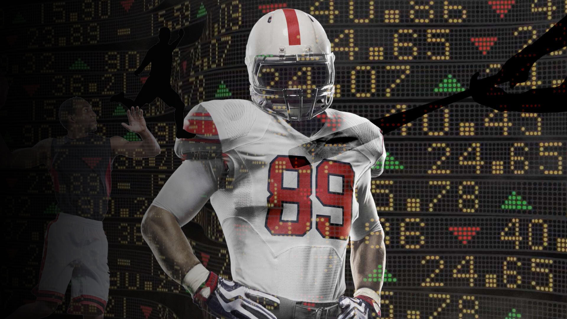
This one is a bit more classic than the avocado indicator and it does just as good of a job at highlighting this phenomenon. A study originally conducted by Leonard Koppett mapped the results of a year’s Superbowl and the following returns for the S&P 500. The Superbowl indicator suggests that if a team from the old NFL wins, then the market will rise that year. If a team from the old AFL wins, the market will fall. This indicator held true with surprisingly high accuracy, up until 1990 the predictor was accurate 91% of the time.
The Sports Illustrated Swimsuit Edition Cover Model Indicator
Yup, this one is pretty much exactly what it sounds like. In another example of “just because you can doesn’t mean you should,” someone over at Bespoke actually fed a computer the various citizenship’s of all the SI Swimsuit cover girls and the S&P 500 return for their respective year. The program then did its thing and began searching for patterns / observations given the data set. What ended up happening was the respective cover girls were separated out between cover models originating from the United States vs those who were not from the United States. It suggested that when the model was from the United States, the S&P 500 would outperform its historical returns (say 8.87% for this specific example.) When the cover model was not from the United States, the S&P would ultimately under perform for that year.
To put this into context, the results of the study actually had some pretty high predictability. When it was an American model on the cover the average returns jumped to 13.9%, when it was a non American model the returns lagged to 7.2%. (Bespoke)
While the 3 above examples are definitely on the lighter side I have seen similar strategies used to suggest actual serious market predictions. With the accessibility of data and the ease we can feed it into computers, it is all too tempting to employ the following formula.
“every time X happens, data suggests we will typically see Y happen”
A great example of this more real world market predictor was in the fourth quarter of 2018 when the market had its “historic” sell off. Historic in the sense that never in history had the S&P 500 been up the first 3 quarters of the year, only to end the year negative. Well, that is exactly what happens. Simply put, these observations / trends derived from big data work until they don’t.
Again, I am not suggesting to write off this type of information all together. When weighed / considered within the proper context among an overall decision making progress they can provide value. But please, please, do not rely on these predictions alone. As with any rational decision process, one must weigh rational, traceable, economic, or business related factors into consideration. Beware of the temptation to lock into any 1 signal and acting on that alone, especially given our estimation that these “trend observations” are only going to become more prevalent.


